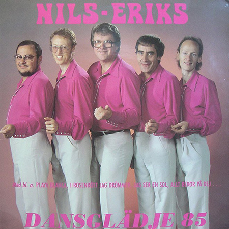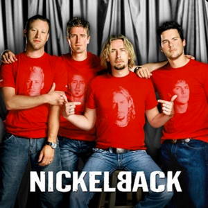
Let’s be honest here. Most band photos look like a police lineup of ding-dongs.
If you’re concerned that you may be among the majority of bands with weak press photos, today’s your lucky day because this post breaks down some great ways to achieve photos that depict you and your band looking like the geniuses you are.
Lighting and Treatment
Lighting and color tone are often overlooked details of band photo.
Before you plan your shoot, find some band photos that you like. I recommend simply searching for bands you like and collecting 5 or so shots that portray a vibe that’s similar to what you want to achieve. Take careful notice of colors, clothing, posture and facial expressions.
Then go through the photos one-by-one with your photographer. Ask questions about how certain effects were achieved and how you might be able to emulate them in your band’s photos.
Based on this conversation, you can start to figure out when and where you’ll want to take photos and your photographer can pick out some lenses that will be appropriate. In addition, you may gain some understanding of what kind of treatment your photos will get in post-production so you can feel more confident discussing treatment levels such as warmth and contrast when asking for any revisions you may like to see.
Frontpeople
Your photos should make it easy for people to tell who the leader is, especially if they have never seen your band before. It’s not the most democratic idea in the world, but, as publicists, we’ve found that bands are more likely to get press coverage when the band leader or lead singer is easy to identify.
The idea behind this is that it’s way easier to feel invested in a band if you have some sense of who they are. But it’s difficult to internalize the faces of four people at once. By making one person the focus of the photo, you’re giving their brain an easy point of entry. Bonus points if the press photos you’re taking are used in an EPK or one-sheet next to a bio that does a strong job of introducing the primary songwriter. (Here’s a whole bunch of info about how to write your own bio!)
To establish your frontperson visually, position them in the middle or foreground of your band photos. If your project has two front people, find some way to display them prominently.
Bands With No Leader
There will be some bands that this approach doesn’t work for. Some projects truly have no front-person, in which case it’s a good idea to prominently display the most interesting looking member of your band. Take a vote.
Singer / Songwriters
If you’re a singer-songwriter or the name of your project is just your first and last name, there’s no need to have your backing musicians in your press shots. You’re at an advantage because solo press photos give you the opportunity to focus on giving a great photo rather than trying to organize a group of musicians around what can be a slightly awkward task.
And a final note on faces: people connect with people. So much of music can feel derivative, but your face is one unique asset you’ll always have. By making the artists’ faces prominent in photos, you can showcase something true and essential about a project.
Beware Of Fun

Holding random objects, having wacky themes, locations, face paint, games, etc. can lead to overly-corny press photos. Make sure to think through concepts like this – does your idea match your messaging?
Also consider: If your band image is lighthearted or mischievous, a wry facial expression may be all you really need to drive that message home.
Face Time
If you get nervous in front of a camera, you might tend to joke or move around to ease the tension. Take a break and try again in five. Sit down, take a deep breath, and remind yourself of the kind of mood you want to project. Get your game face on.
People also tend to make a “photo face” when they’re being photographed. Jaws tighten. Eyebrows shoot up. Mouths take a variety of strange shapes. Personally, my default tends to be what I can only describe as soccer-mom face.
Try to relax your face and stand up straight. Practicing in the mirror beforehand will save you some heartbreak and aggravation.
Consider Your Material
If you want to visually unify how your band is represented, consider aiming to match the visual mood of your current or upcoming album art or music video.
It can also be effective to match your photos to your band’s color scheme if you have one.
What To Wear
Your band may need some direction on what to wear. The best way to start is by picking out some colors with your band ahead of time and instructing everyone to bring a couple different shirt options to a shoot. Be mindful of distracting clothing. Stripes, plaids, band shirts, big logos, and statement accessories take up a lot of visual real estate. If you’re wearing something loud, make sure it’s lending itself to the photo you’re looking to build.
And About Hats
We all love hats, but when photographed, they can appear more prominent than the face they’re on top of. If hats are your thing, check in with your photographer to make sure you’re still getting some light on that mug of yours.
Photos For The Press
Here are several important things to keep in mind when you’re providing photos to music writers and bloggers:
1. It’s good to send landscape and portrait options, so make sure to plan your shoot accordingly. Landscape-oriented photos are usually the ones writers and editors prefer to use.
2. According to the Oregonian’s former music editor David Greenwald, it’s helpful to title your photo files like so:[band]_[photographer]_[year]. This allows writers to immediately tell that the photos are recent. It’ll also make the files easy to locate and they don’t have to send you an additional email requesting a photo credit.
3. Make sure that your press materials include downloads of your high-resolution photo files.
In Conclusion
Remember this: your band’s photos can be an extension of your music. The best case scenario is that your photos honestly communicate the human emotions that gives your music life.
Alternately, if the idea of band photos feels scary and weird to you, just keep it simple. There’s absolutely nothing wrong with extremely simple, well-done photos.


